Low Level Design : Component Design


Low-Level Design in Frontend
In React, everything is a component. Even on a web page, whatever we see is an element, and a collection of elements forms a component—like an image component or a logo component. A composition of multiple components forms a complete web page. Components are the building blocks of a web page.
Low-Level Design in Frontend
Front-end low-level design refers to the detailed, component-level design process within a web application's user interface. It focuses on the specific implementation of individual features like buttons, forms, or modals, their interactions, rendering patterns, and performance considerations.
So, it’s all about how code is written and how components are structured.
If you are asked to design a web page with a navbar and some cards, it will look like this:
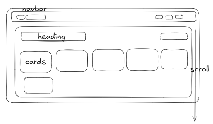
Code wise it will look like this
<AppCOmponent>
  <Header>
     <left>
       <logo>
           <img>
       </logo>
      </left>
      <right>
         <nav elements/>
      </right>
   <Header/>
Low-Level Design in Frontend
In an interview, you need to explain everything clearly to show that you have proper knowledge of how to structure and design an entire web application.
You should be able to talk about:
- Scrollbars (horizontal, vertical) and how they work.
- Which libraries you will use to enhance user experience.
- How to design platforms like YouTube—where components will be placed, how many components will be there, and how they will interact.
Your code should be:
✅ Modular
✅ Reusable
✅ Readable
✅ Testable
✅ Scalable
Design a Sidebar
If an interviewer asks you to design a sidebar with a toggle state, you need to explain:
- Where to place your components.
- How to manage state properly.
- How to structure the component for efficiency.
Check out my portfolio where I have written notes on this! 🚀
Component Hierarchy
Before writing code, focusing on component hierarchy is a must. It helps in:
✅ Better structure
✅ Easier maintenance
✅ Less refactoring in the future
Always plan your components on digital notes or a notebook before writing code. This ensures efficient design and scalability in your project.
SOLID Principle
S: Single Responsibility Principle (SRP)
- This applies to components as well.
- A component should have a single responsibility—don't write 500-600 lines of code in one component.
- If a file is too big, break it down into smaller reusable components.
📌 We will discuss other SOLID principles later—stay tuned!
Higher-Order Components (HOC)
A Higher-Order Component (HOC) is a component that wraps another component to add extra features.
Example:
-
Suppose you have a Card component.
-
You want to add a "Pro" tag for premium users.
-
Instead of modifying the existing Card component, create a new PromotedCard component that wraps the Card component and adds the "Pro" tag.
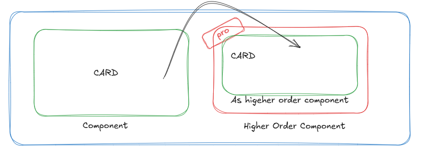
➡️ HOC takes a component as input and returns a new enhanced component.